Simple Plot Script Tutorial
This is a short tutorial that covers creating a plot from feature datasets.
Introduction
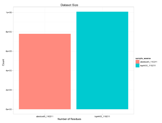
The script plots the total number of residues in each sample source as a bar graph. The full code for this script is in the features scientific benchmark ( rosetta/main/tests/scientific/cluster/features/scripts/analysis/plots/EXAMPLE_PLOT.R ).
The script uses SQL to extract the number of residues for each sample source in to an R data.frame, and then declares how the plot should look using ggplot2:

The Code
Here is the meat of the script.
    query_str <- "SELECT count(*) AS num_residues FROM residues;"            # define SQL query string
    feat_data <- query_sample_sources(sample_sources, query_str)             # apply the query to each sample source

    plot_id <- "EXAMPLE_PLOT"                                                # define the name of the plot
    plot <- ggplot(data=feat_data) +                                         # define a plot of the feat_data
        geom_bar(aes(x=sample_source, y=num_residues, fill=sample_source)) + # map the data to the x, y, and fill values that define the bars
        theme_bw() +                                                         # having the "black and white" theme
        opts(title="Dataset Size") +                                         # specify the title of the plot
        opts(labels=list(x="Number of Residues", y="Count"))                 # specify the axis labels
    save_plots(sample_sources, plot_id, output_formats)                      # generate the last defined ggplot2 plot
How the Script Works
This file no longer exists.
To run this script call compare_sample_sources.R with like this:
    Rosetta/main/tests/scientific/cluster/features/compare_sample_sources.R \
       --script scripts/analysis/plots/EXAMPLE_PLOT.R \
       /path/to/features_SampleSource1.db3 \
       /path/to/features_SampleSource2.db3
Extract Data
The first step is to extract the relevant information from the feature datasets.
query_str <- "SELECT count(*) AS num_residues FROM residues;" # define SQL query string
This defines a string with the text of an SQL query statement. The <- is the syntax for R for variable assigment. If one were to run this query on an features database, say from a shell, it would return table with one row and one column:
    $sqlite3 features_SampleSource1.db3
    sqlite3> .header ON;
    sqlite3> SELECT count(*) AS num_residues FROM residues;
    num_residues
    1007248
This queries the residues table and applies the COUNT function to get the total number of rows returned. Since each row in the residues table corresponds to a distinct residue extracted from the set of input structures that defines the sample source, the number that is returned is the total number of residues in the sample source.
Since we are interested in comparing the features between different sample sources, we use the query_sample_sources function to apply the query to each one and return all results all at once.
feat_data <- query_sample_sources(sample_sources, query_str) # apply the query to each sample source
sample_sources is a global variable initialized by compare_sample_sources.R containing information about each of the feature databases that were passed in. query_sample_sources returns a R data.frame containing the results of applying the SQL query to each of the sample sources. To keep the where the data came from straight, there is an additional column sample_source that indicates the sample_source_id.
As an example, this script was run with the two sample sources, features_top4400_110211.db3' and 'features_abrelaxlr5_110211.db3' then, it would contain the following data:
    summary(feat_data)
          sample_source num_residues
    1    top4400_110211      1007248
    2 abrelaxlr5_110211       778320
Declaring Plots
Here we are going to make plots called EXAMPLE_PLOT.
plot_id <- "EXAMPLE_PLOT"
To do this we use the ggplot2 data visualization package for R. The central idea is to map the columns of the input data to defining properties of the visual elements on the plot. In this tutorial, the input data is the feat_data data.frame which has the columns sample_source and num_residues .
The essential information needed to define a bar graph is the identity of each bar ( x ), the height of each bar ( y ), and the color of each bar ( fill ). So we wish to define the following mapping:
     sample_source ---> x
     num_residues  ---> y
     sample_source ---> fill
For the fill dimension, each sample source is mapped to a different color. To specify this intention in code:
    plot <- ggplot(data=feat_data) +                                         # define a plot of
        geom_bar(aes(x=sample_source, y=num_residues, fill=sample_source)) + # map the data to the x, y, and fill values that define the bars
The rest of the information to specify the plot is to make it look pretty
- Use the "black and white" theme
- Add a title
- Add axis labels
        theme_bw() +                                                         # having the "black and white" theme
        opts(title="Dataset Size") +                                         # specify the title of the plot
        opts(labels=list(x="Number of Residues", y="Count"))                 # specify the axis labels
Generating The Plots
Once the EXAMPLE_PLOT has been declared, to apply the data and generate the plots we call save_plots :
save_plots(sample_sources, plot_id, output_formats) # generate the last defined ggplot2 plot
The sample_sources variable the same one used to extract the features above.
The output_formats variable is defined by the compare_sample_sources.R driver script. It includes information about what output formats should be generated: whether it is a "pdf", "png", or "svg" file, the dimensions of the plot, etc. By default, the output_web_raster output format is used and generates a file of the format
<plot_id>_with_<sample_source1>_<sample_source2>_..._<yymmdd>.<output_format_extension>''.
in the output directory:
[1] "Saving Plot: build/output_web_raster/EXAMPLE_PLOT_110311_with_top4400_110211_abrelaxlr5_110211.png"
See Also
- Features reporter overview: The FeaturesReporter home page
- R tutorials for FeaturesReporters
- FeaturesTutorials: Tutorials for using FeaturesReporters
- FeatureReporters: List of implemented FeatureReporters
- RosettaScripts home page
- RosettaScripts database connection options
- Database IO: Input/output to databases using Rosetta